
Written By Abbie Schenk
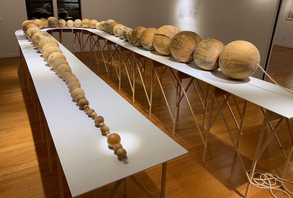
When we think of data visualizations, we often think of charts, maps and other forms of expressing data in digital ways. But humans have visualized data for thousands of years, long before computer screens were invented. Some of the earliest data visualizations go back to 5500 BC when Mesopotamians used clay tokens to visualize data. Today, representing data in a physical manner is called data physicalization. The Digital Scholarship Centre (DSC) is currently exploring data physicalization and how it could fit with our mission.
“Data physicalization involves representing numbers and relationships using physical, tangible displays [to] unlock new analytical insights and emotional responses” (Alexander et al., 2019, p. 127).
There are many benefits to displaying data physically. Data physicalization can be used to create greater exploratory experiences with data, such as using spikey balls to demonstrate the experience of chronic pain in a tactile manner — impossible without a physical object (Alexander et al., 2019). Data physicalization can also be used for accessibility, such as using acoustic sonifications to demonstrate data through sound. Finally, data physicalization can afford a greater participatory experience. FluxMarker (Suzuki et al., 2017) is a tactile map created in collaboration with people with visual impairments, which used magnetic markers to convey data rather than a two-dimensional map.
The DSC is interested in using data physicalization to take advantage of the technologies we have, including 3D printers, laser cutters and our recording booth. Data physicalization could be useful in helping workshop participants focus and reflect on topics (Moretti & Mattozzi, 2019) and provide a unique learning experience.
We are currently living through a pandemic, which might alter our relationships with the physical world around us. Many examples of data physicalization rely on tactile interactions with physical objects. When the DSC reopens, people may be concerned about the safety of physical interaction. This will require, at the very least, higher sanitation for high-touch surfaces — but it could also decrease the overall desirability of these high-touch surfaces in the first place. As an organization interested in data physicalization, we will have to carefully consider how we choose to produce them.
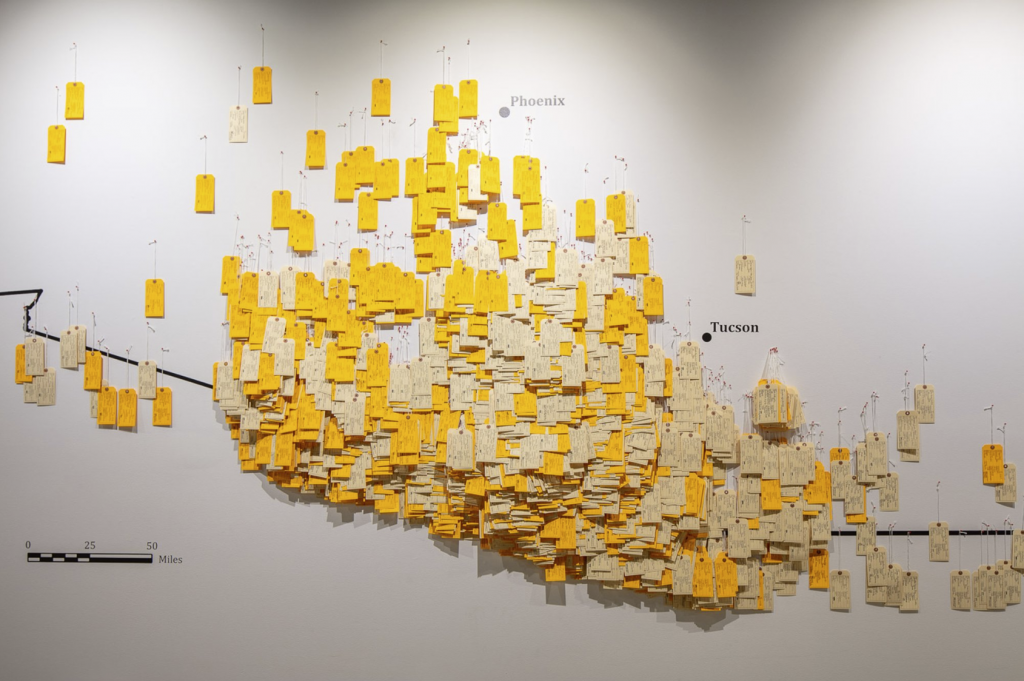
Many resources and examples of data physicalization can be found on the Data Physicalization Wiki. These include solving the shortest route problem using 3D-printed models, tattoo biosensors used to detect glucose levels and multiple examples that provide a sense of scale of human crises.
The DSC is currently collaborating with University of Alberta Library staff on Stitching the Curve, a collaborative knitting project to represent the number of COVID-19 cases in each province of Canada. The individual strips of yarn will be joined together into one blanket once the pandemic abates. More updates on this project will be posted to this blog soon.
When we return, we hope to work with other learners interested in data physicalization in workshops and actively contribute by creating our own. If you have ideas, we would be interested in hearing from you at dsc.library@ualberta.ca!
References
Alexander, J., Isenberg, P., Jansen, Y., Rogowitz, B., & Moere, A. V. (2019). Data Physicalization. Dagstuhl Reports, 8(10), 127-147.
Data Physicalization. (2018, November 1). Data Physicalization Wiki. http://dataphys.org/
Desjardins, A., & Tihanyi, T. (2019, June). ListeningCups: A Case of Data Tactility and Data Stories. In Proceedings of the 2019 on Designing Interactive Systems Conference (pp. 147-160).
Jansen, Y., Dragicevic, P., Isenberg, P., Alexander, J., Karnik, A., Kildal, J., & Hornbæk, K. (2015, April). Opportunities and challenges for data physicalization. In Proceedings of the 33rd Annual ACM Conference on Human Factors in Computing Systems (pp. 3227-3236).
Kegel, F., & Hemmert, F. (2019). SandExplorer: Exploring Geospatial Data, Grain by Grain. In Proceedings of Mensch und Computer 2019 (pp. 457-461).
Le Goc, M., Perin, C., Follmer, S., Fekete, J.D., & Dragicevic, P. (2018, October 3). Dynamic Composite Data Physicalization Using Wheeled Micro-Robots. In IEEE Transactions on Visualization and Computer Graphics 25(1) (p.737-747).
Moretti, M., & Mattozzi, A. (2019, July). Participatory Data Physicalization: A New Space to Inform. In International and Interdisciplinary Conference on Image and Imagination (pp. 1061-1080). Springer, Cham.
Rosling, H. (2010, June). Global population growth, box by box. TED. https://www.ted.com/talks/hans_rosling_global_population_growth_box_by_box/up-next
Ruzicka, E. (2020, January 23). Five Lessons on Data Visualization From a Data Physicalization Failure. Nightingale / Medium. https://medium.com/nightingale/5-lessons-on-data-visualization-from-a-data-physicalization-failure-6d7607d00ffa
Suzuki, R., Stangl, A., Gross, M. D., & Yeh, T. (2017, October). FluxMarker: Enhancing Tactile Graphics with Dynamic Tactile Markers. In Proceedings of the 19th International ACM SIGACCESS Conference on Computers and Accessibility (pp. 190-199).
Wannamaker, K., Willett, W. J., Oehlberg, L. A., & Carpendale, S. (2019). Data Embroidery: Exploring Alternative Mediums for Personal Physicalization.
1 comment
I just ran across your 2020 article on data phys featuring one of my works at the top, Thanks for including that piece and, should you want more, check out lorenmadsen.com/data_art