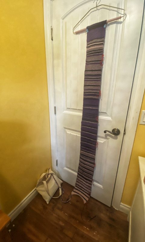
It is astonishing to think that it has been nearly nine months now since a majority of library staff began working from home. It has also been nine months since a group of us began a project to capture COVID-19 numbers in Canada by working on a collective stitching project we call “Stitching the Curve”. The project aims to capture the ongoing COVID-19 case numbers from province to province, within strips of knitted or crocheted yarn pieces that will be stitched together at the end of the pandemic to form a blanket. As librarians, we are always looking for different ways to teach information and data literacy. The purpose of the project has been to experiment with different ways of representing data and information. Our aim has been to learn about epidemiological data, educate our community about COVID-19 and, also, to work together in capturing a moment in history.
It has been a long journey for each of us. We have been busy working from home and dealing with the many challenges that the pandemic has brought into our lives. As we have worked with students and faculty during the day to offer library services, in our off-time our knitting and crocheting have brought our swatches to life. Our strips of data have grown in length and changed in the colours they reflect, as case numbers have risen, dipped and then spiked again. Over the past few months, our swatches have changed dramatically, as provinces that usually lingered in the lower number ranges have shifted to lighter colours (higher numbers). I asked the group to share their thoughts with me:
“It has certainly been frustrating to follow the numbers in the spreadsheet while also following the news. We know how to bring those numbers down, but people from the Legislature on down refuse to accept medical advice. And so the pandemic will be longer and more painful than it needs to be. I remember when we started, we at first considered charting the number of recoveries rather than the number of new cases, so as to make our project reflect the positive side of the story. Now we find ourselves chronicling a story of unnecessary suffering. Just trying to keep the faith here, and bear witness. It will feel better when the curve starts to bend in the right direction again.”
Peter Binkley
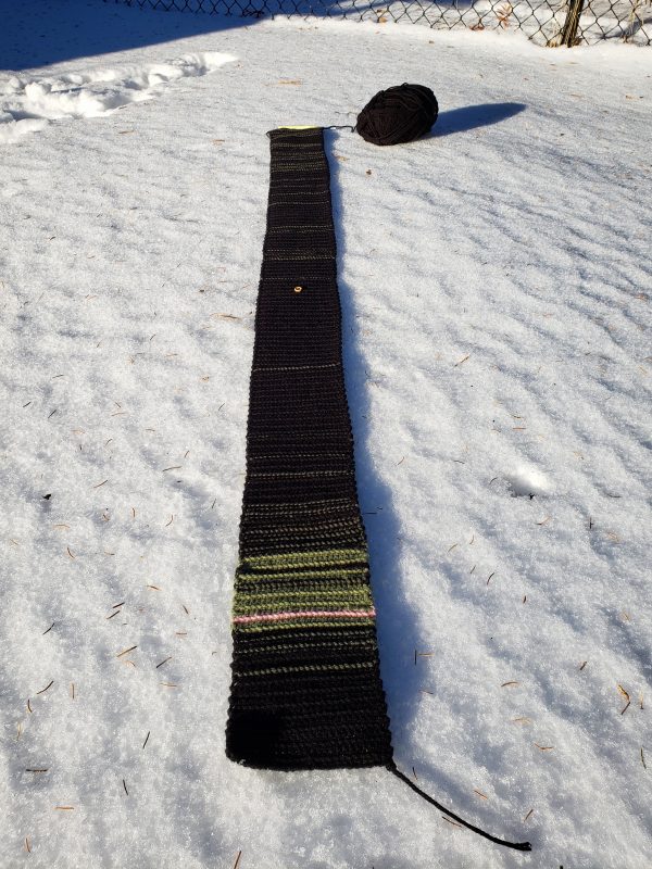
“As the person responsible for knitting the north (Yukon, NWT, and Nunavut combined) I’ve been happily knitting in one dark colour for several months, and appreciating that the isolated and vulnerable populations (most of whom are Indigenous) of our northern territories have been “safe”… I’ve been feeling very reluctant to manifest the data representing the recent upsurge in cases since Nov 15 (most of them in Nunavut). I’ve also been experimenting with some techniques that will represent the “North” as a whole, but also acknowledge the difference in experiences between the 3 territories…and I’m also thinking about how the data still doesn’t tell the whole story…in terms of the number of cases compared to the entire population of an area.”
Lucinda Johnston
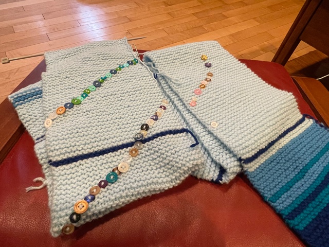
“Much like so many things during this pandemic, I have left my knitting for a while. I suddenly realize I am months behind and then scramble to catch up. I find it very sad that this second wave is so terrible, and I was worried I would have to find more light colours as so far I have only had to use black and purple (I am doing New Brunswick). While there is good news on the horizon with the vaccine, I know that when we end our knitting in February that the pandemic will not be over. I think about how naive I was when we started this – I thought we would be home for a few weeks, and then a few months. I never would have imagined the devastation that COVID-19 would bring to Canada.”
Connie Winther
As a group, we have also been intrigued by other data enthusiasts who are also creating yarncraft objects out of COVID-19 information. Fellow stitcher Kara Blizzard discovered this great video by Dr. Katherine Frey Frøslie, a Professor in Biostatistics in Norway. She has created models that demonstrate R-values, so essentially her video and objects explain the infectiousness of COVID-19 in crocheted strips.
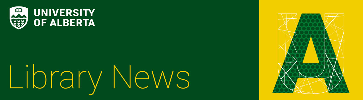
Frøslie’s video is an excellent example of how data physicalization can be used to understand complex concepts. In our stitching, some of us have learned how each province is collecting their data (in weekly cycles for example), while others have had to stitch on with either the monotony of constantly low case numbers (dark colours) or the frustration of constant case high numbers (light colours). In some cases, each stitcher has used markings or ‘annotations’ on their swatches to indicate important dates or numbers that cannot be reflected in the set colour ranges of the project.
As the pandemic continues, many have wondered when we might stop our stitching. After some discussion this fall, we have decided as a group to continue our swatches and to finish the project at the end of February. By ending the swatches in February, they will comprise 12 full months, or a full year snapshot of the pandemic. We felt with the rising numbers it was important to continue for the time being, but as the pandemic grows longer, we also want to put an end date to the project. The pandemic will likely continue past February 28th, but ending at a full year will allow us to bring the project full circle, while also providing us all with closure and a sense of accomplishment.
It has been a difficult year for everyone, and when we started on this journey we never imagined it would continue for so long, nor did we have a sense of how much this pandemic would come to affect all our lives. Over time, the project has come to have a lot of meaning for each of us. Sometimes it brings to light the very sad realities of how many people are getting sick, but it also reminds us of the rebirth of kindness and sense of community that has been reborn through all this adversity. We are hanging onto the hope that as the government is beginning vaccine distribution, we will soon be able to come together with our swatches and find a way to bind them together as one final blanket; as an object of comfort, caring, and remembrance, of a year felt keenly all over the world.